Expanding Design Systems at AstroPay

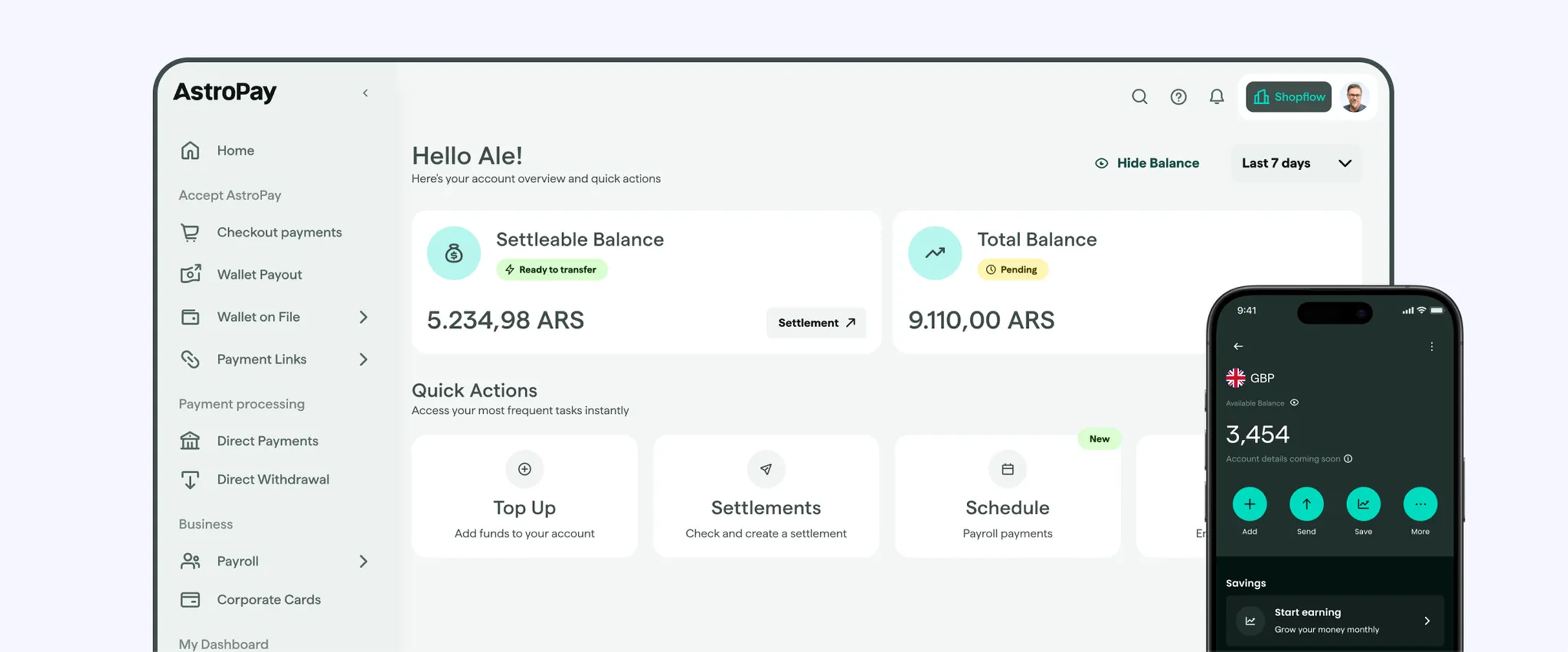
When I started working at AstroPay, their design system was built in a single Figma file. The original system was solid. It had a well-structured UI kit with icons, color schemes, and text styles that served the B2C wallet app well for latest launch. But as AstroPay grew and added a desktop dashboard, the limitations of a single-file approach became noticeable.
Everything was in one place: variables, components, and illustrations. The system only covered the B2C wallet, and the B2B dashboard had no design infrastructure at all. Designers weren't confident about which components were actually implemented in production, and there was no way to verify if Figma matched production code.
The Problem We Were Solving
The team was facing critical issues that impacted development speed and design quality:
Structural problems: A single Figma file containing everything for B2C only, no design system for the B2B dashboard, no governance model, and zero visibility into which components were actually implemented.
Team impact: Designers lacked confidence about implementation status, had no way to verify if Figma changes matched production code, used components inconsistently across squads, and the B2B product was being developed without design system support.
I identified these gaps and proposed restructuring the design system infrastructure. The design team was receptive, and we started making improvements in Q2 2025.
How We Approached It
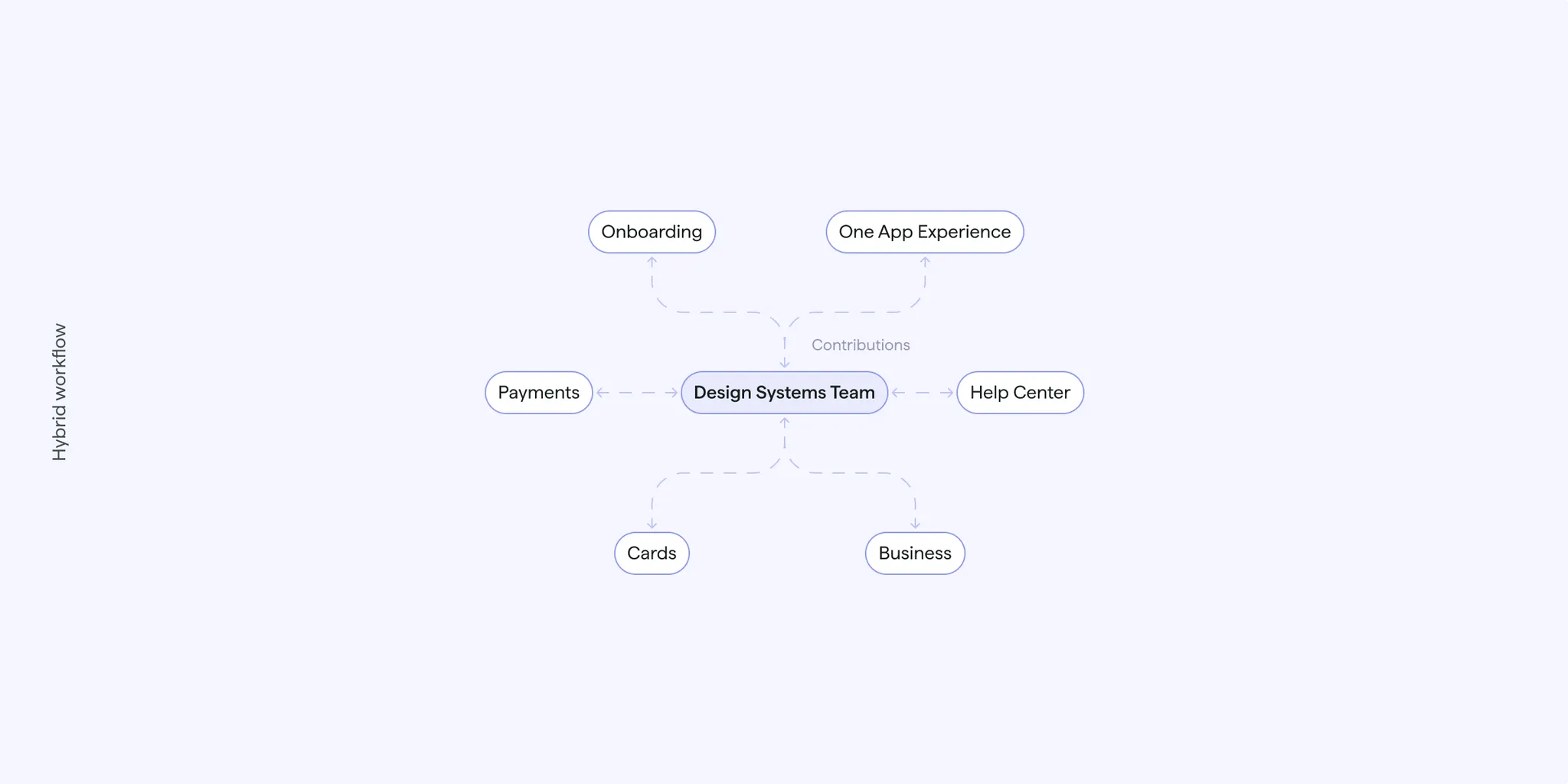
Rebuilding The Infrastructure
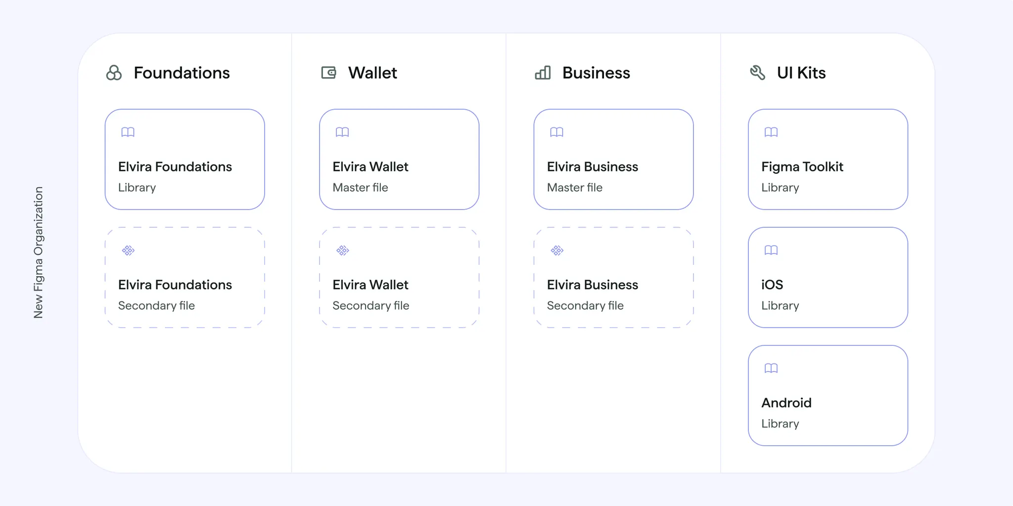
I reorganized the entire Figma workspace to support scalable product design across multiple platforms, building on the solid foundation that was already there.
The new structure included Elvira Foundations, which holds color and spacing variables, text styles, icons, and other company-wide assets that work across all products, Elvira Wallet, an expanded design system for the B2C mobile app, evolving the original work, and Elvira Business, a new B2B design system built from scratch. Lastly we also have a set of native iOS and Android UI Kits components plus handoff resources for developers.
Technical Architecture
The design system is built on a token-based architecture that prioritizes scalability and platform consistency. We structured design tokens in two layers: primitive tokens containing raw values (hex codes, pixel measurements, font weights), and semantic tokens that reference primitives with contextual meaning (brand_surface, border_base )
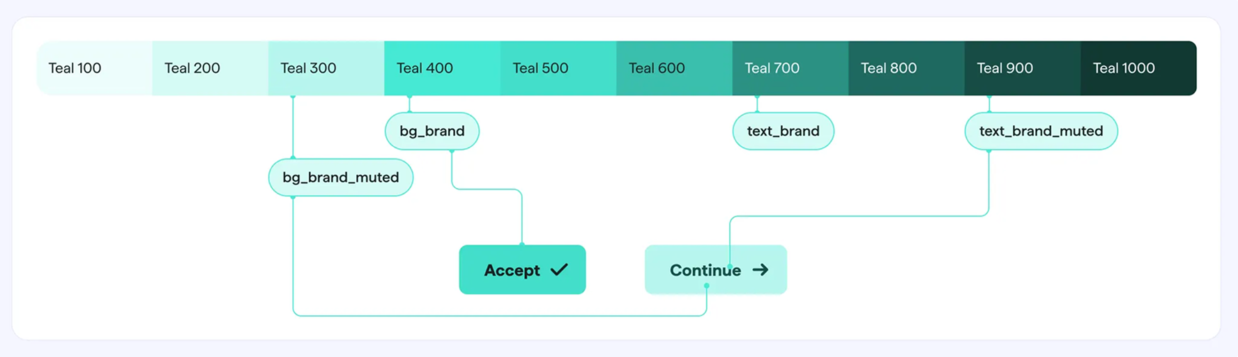
This separation allows platform teams to swap primitive values for native conventions while maintaining consistent semantic applications across products. For example, iOS and Android teams can adjust spacing primitives to match platform guidelines while the semantic tokens ensure UI patterns remain visually aligned.
Components follow an 8-point grid system for spatial consistency. Each component was built with variants to handle multiple contexts: size variations (small, medium, large), state variations (default, hover, active, disabled), and platform-specific adaptations where necessary. This variant structure reduces design debt by preventing one-off component creation.
Typography scales use modular type systems with clear hierarchy levels. Spacing tokens are organized in t-shirt sizing (xs, sm, md, lg, xl) that maps to the 8-point grid, making it easier for designers to maintain consistent spatial relationships without manual pixel calculations.
.webp)
Master and Secondary File System
This governance structure solves the core problem of implementation uncertainty. Master files contain only components that have been reviewed, approved, and implemented in production code. Designers can trust that anything in a master file is safe to use and matches what developers have built.
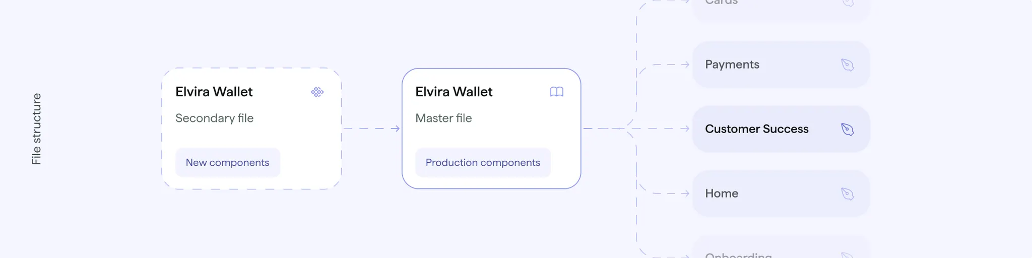
Secondary files hold work-in-progress components that are still being designed, reviewed, or implemented. This creates a clear staging environment where new components can be developed and tested without disrupting designers who need stable, production-ready assets.
When a component completes the review and implementation process, it's promoted from secondary to master, triggering an automatic library update for all designers. This workflow prevents the confusion that occurs when designers use components that don't exist in code yet, or when implemented components differ from what's in Figma.
Setting Up Governance That Works
Infrastructure is worthless without clear processes. We established team workflows that made the design system sustainable:
We defined a governance model with clear roles and responsibilities, implemented bi-weekly design system sessions across all squads, created component documentation standards in Figma, and introduced analytics tracking with regular team communication.
Cross-squad collaboration became systematic: regular check-ins to understand designer needs, proactive identification of new component requirements, and a component review process to ensure design consistency.
Auditing Everything Across Platforms
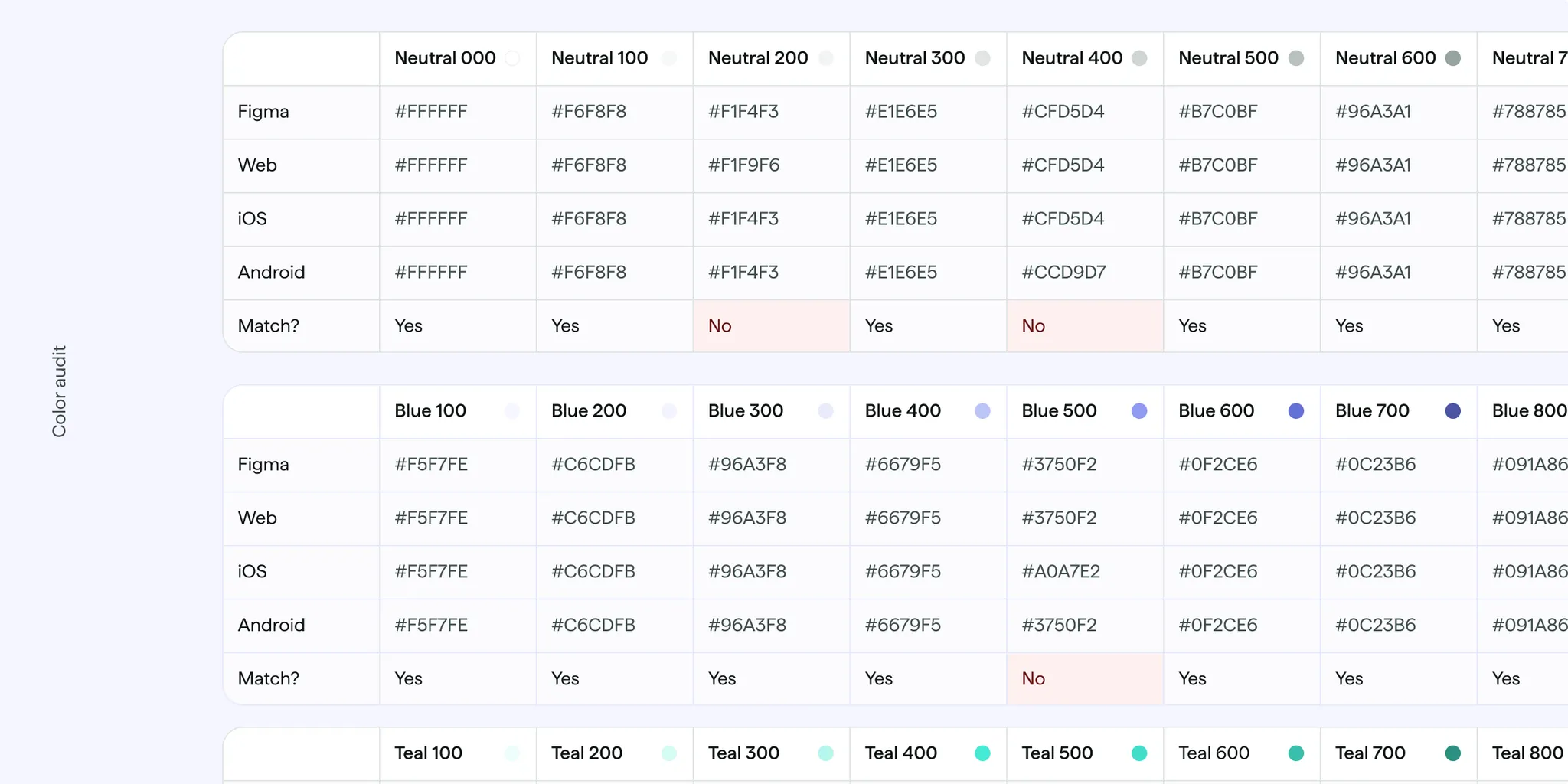
One of the biggest problems was the disconnect between design and code. We developed a comprehensive audit process to ensure alignment across all platforms.
Color Token Audit: We collected color values from the Web, Android, and iOS codebases, systematically compared primitive and semantic color tokens, and documented alignment percentages across all platforms. The results showed strong alignment with minimal mismatches, which was a relief.
Component Audit: We're currently auditing component implementation across platforms, doing a systematic review of design system adoption and usage patterns. This ongoing work helps us understand what's actually being used and where gaps still exist.
How Components Scale Across Platforms
Component design decisions prioritized multi-platform implementation from the start. Each component maintains consistent visual language while adapting to platform conventions. For example, our file upload component uses the same colors and text styles across Web, iOS, and Android, but respects platform-specific interaction patterns (ripple effects on Android, haptic feedback triggers on iOS).
.webp)
We documented these decisions directly in Figma using component descriptions and annotations. Each component page includes implementation notes specifying things like accessibility requirements related to color contrast ratios.
The token audit revealed that maintaining strict 1:1 alignment across all platforms isn't always optimal. In some cases, platform-specific adjustments improve the native feel of each product. Our governance process now includes explicit decisions about when to maintain strict alignment versus when to allow platform variations.
What Changed
The project changed how AstroPay's design team operates. We now have full team participation (6 designers) in bi-weekly design system sessions, eliminating the "implementation uncertainty" that previously slowed development. Designers have clear visibility into component status and can verify that Figma matches production code through systematic audit processes.
The system expanded from B2C-only coverage to full B2C and B2B support across Web, iOS, and Android. Cross-platform token alignment is verified through regular audits, and proactive component governance prevents design debt from accumulating. Design review cycles shortened through proactive component alignment checks, giving designers confidence to move faster on new designs.
We created sustainable infrastructure that supports scalable multi-product design system management with clear governance for future growth. The component audit work continues as we establish regular audit cycles for ongoing maintenance. We're also introducing comprehensive content guidelines to ensure consistent voice and messaging across all touchpoints, aligning content standards with the visual design system.
Lessons from Rebuilding AstroPay's DS Infrastructure
This project started as a self-initiated effort, and after almost a whole year working with our new structure, here's what we learned:
The master/secondary file system solved our biggest problem: designers not knowing what was safe to use. If your team struggles with implementation uncertainty, create a clear boundary between components-in-development and production-ready components.
Our color audit showed strong alignment, but we learned that perfect 1:1 matching across platforms isn't always the goal. Sometimes platform-specific adjustments improve the native experience. Define upfront which elements must be identical (brand colors, core spacing) versus which can flex for platform conventions (interaction patterns, motion timing).
Infrastructure problems compound quietly. Single-file design systems work fine for one product with 2-3 designers. They break silently as you scale. By the time everyone notices, you're already accumulating design debt. If you're adding a second product or platform, restructure proactively rather than waiting for things to break.
Proactive governance prevents problems. Bi-weekly sessions gave us a regular forum to catch issues early. Without scheduled check-ins, governance happens reactively (someone uses the wrong component, then you fix it).
While reorganizing the tools was important, real transformation came from establishing clear processes, governance, and communication patterns that gave the team confidence and clarity. Managing design systems across multiple platforms requires systematic approaches to verification and alignment. Manual processes don't scale beyond small teams, and investing in the right infrastructure early pays off in velocity and quality later.
At Flexxi, we work with fintech companies to scale their design operations. Design systems go beyond component libraries, giving teams the confidence and tools to ship better products faster. If your team is facing similar challenges, let's talk.
Notifications and Alerts